
Brand Guide
By following these standards, we ensure consistent and appropriate representation of our brand across all touchpoints.
Last Updated: February 2026
Brand Overview
Our brand is who we are. It’s the set of ideas, emotions, and associations that come to mind whenever someone thinks about Solace Power. In fact, even though we do some really awesome stuff, our brand is our most powerful asset. It shines through in our website, our mailings, our videos, even our email signatures. But, it’s even more than that. It’s how we talk to our clients and partners, and how we talk to each other. We’re really smart, friendly, and passionate people – and so is our brand.
Our brand is a valuable asset that requires careful stewardship. To maintain its integrity:
By following these standards, we ensure consistent and appropriate representation of our brand across all touchpoints.
Brand Review
A quick brand review helps ensure your materials are ready to go without unexpected revisions or delays. Submit your asset(s) to get clear, confident approval before it’s shared more widely.
Visual Identity
The logo is often the first impression people have of the brand. Using it consistently protects recognition and prevents dilution, which strengthens trust over time.


Our Tagline, Power Beyond, is important to keep with the logo – using our tagline effectively will help build brand equity and remind our audiences who we are and what we do. But we don’t use it in cases where it doesn’t make sense (i.e. if it’s too small and you can’t read it).



The Solace Symbol is a supporting brand element that can be used to reinforce brand presence. It can be used for restrictive or small spaces, ideal for smaller responsive design layouts or small profile pictures (under 100px). This is not a replacement for the primary logo, brand recognition still relies on the "Solace" name being included, so it's important to use the primary logo wherever possible.

Print: 0.3 in
Digital: 50 px

Print: 0.2 in
Digital: 25 px
Motion adds energy and emphasis when used with purpose. Consistent animation styles prevent distraction and make the brand feel polished and intentional.
The Solace logo animation can be used for video or animated materials to create a memorable impression and impact. The particles that flow through the logo represent power transfer and wireless power.

Examples remove ambiguity and reduce guesswork. They help teams move faster by clarifying expectations without lengthy explanations.






Color is one of the fastest ways people identify a brand. Sticking to the defined palette builds instant familiarity and ensures accessibility across platforms.
Typography shapes how professional, modern, or approachable we feel. Consistent type choices create cohesion and make content easier to read and absorb.
Museo Sans is our official typeface, and we’re serious when it comes to fonts. It should be used in all corporate material, including brochures, website updates, tradeshow materials, etc.
Strong layouts create clarity and hierarchy. Following spacing and grid principles makes content easier to scan and more enjoyable to engage with.
The following is an example of typography pairings, you can follow closely but sizes may differ depending on application. The size ratios and spacing of headings to paragraph text is important to maintain for readability.
Heading
Sub-Heading
Donec ullamcorper nulla non metus auctor fringilla. Sed posuere consectetur est at lobortis. Donec id elit non mi porta gravida at eget metus. Maecenas sed diam eget risus varius blandit sit amet non magna. Fusce dapibus, tellus ac cursus commodo, tortor mauris condimentum nibh, ut fermentum massa justo sit amet risus.
Sample Link - Maecenas sed diam eget risus varius blandit sit amet non magna.Fusce dapibus, tellus ac cursus commodo, tortor mauris condimentum nibh, ut fermentum massa justo sit amet risus.
Font: Museo Sans
Font Weight: Normal - 500
Font Size: 46px
Colour: Dark Blue | #0B314F
Font: Museo Sans
Font Weight: Light - 300
Font Size: 26px
Colour: Dark Blue | #0B314F
Font: Calibri
Font Weight: Normal - 400
Font Size: 21px
Colour: Dark Grey | #535c62
Font Weight: Normal - 400
Font Decoration: Underline
Colour: Teal | #030C40
Font Weight: Normal - 400
Colour: Red | #F15A60
Rounded Corners: 30px
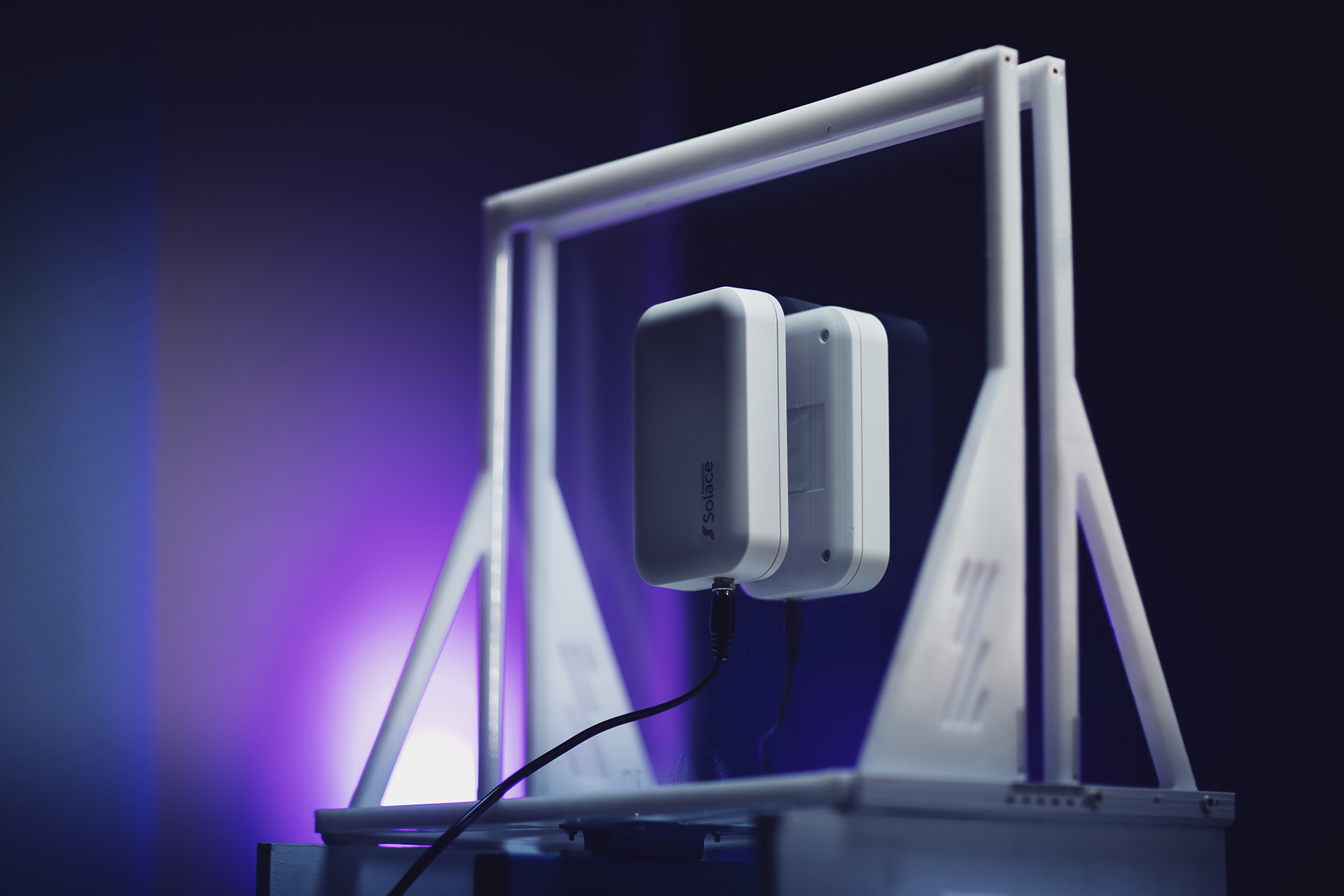
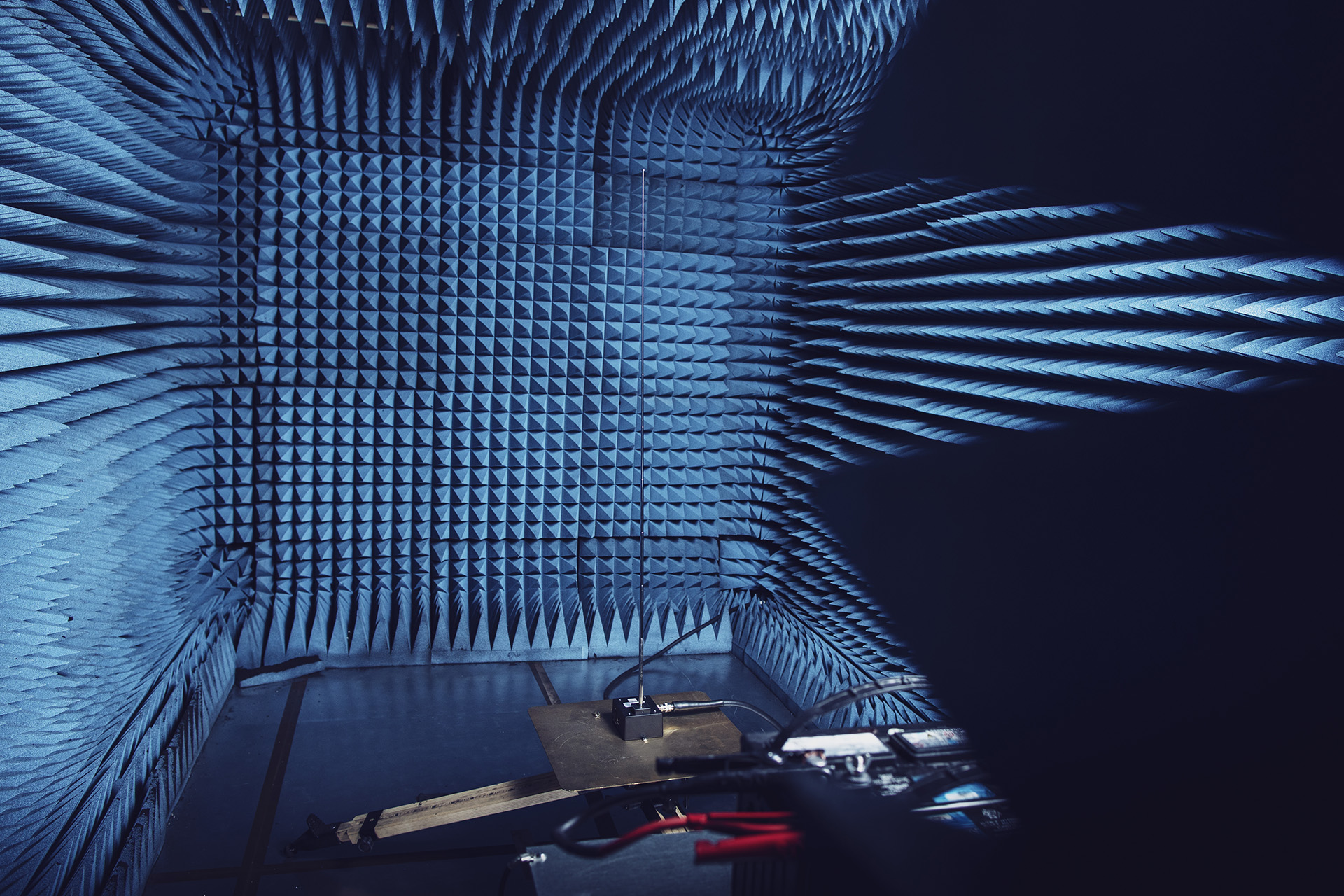
Imagery communicates emotion faster than words. Aligning to a defined style ensures our visuals reinforce the same story instead of sending mixed signals.











Icons simplify complex ideas and improve usability. A consistent icon system makes materials feel unified and easier to navigate.













FontAwesome 7 (Classic - Regular) is our standard icon set for when custom icons are not available to match content. This is a free icon set that can be used as a font or individual icons can be downloaded as image files (.png, .svg).
Voice
We know we’re smart, but we also know the real test of intelligence is to simply communicate said intelligence. That’s why we write as humans, not engineers. We avoid overuse of industry jargon, and always spell out our acronyms at least once. We make it easy for those who want to learn about us to do so. We explain with real examples, instead of hiding behind numbers and symbols. In fact, we always answer the “so what does that mean?” question when we’re preparing materials for external use. While we never “dumb down” our incredibly complex technology, we demonstrate our complexity with approachable language.
We are intelligent but not snobby, we never use condescending language (we want people to like us, and our technology). We are confident, and we should be, because we are informative and knowledgeable about what we do. We like to be concise when possible, but we aren’t shouty (as in we don’t use all caps or lots of punctuation). We respect the intelligence of the audience, but we are friendly in our approach to content. Most importantly, we’re always professional, and while we’re fun, we aren’t over casual. If our tone was a person, he’d probably have a collared shirt on with a Star Wars t-shirt underneath.
General Formatting Rules (Recommended Standard)
1) Always include a space between the number and unit
2) Units are case sensitive (b = bits, B = bytes, k = kilo is always lowercase)
3) Do not pluralize units
4) Use decimals for precision, not mixed units
5) Keep unit symbols the same for singular and plural
Electrical Power
Examples:
Electrical Current & Voltage (often needed with power)
Examples:
Energy (power over time)
Examples:
Frequency
Examples:
Data Rates (bits per second)
Use lowercase "b" for bits. Capitalization matters.
Examples:
Data Transfer / Storage Rates (bytes per second)
Use uppercase "B" for bytes.
Examples:
Reminder: 1 byte = 8 bits.
1 MBps = 8 Mbps.
Storage Capacity (bytes)
Common for memory, files, and drives.
Examples: